image credit: steelerswire.usatoday.com
Bottom line up front (BLUF)
1) With the exception of tight ends and quarterbacks, analysts improved significantly at predicting the top 10 at each position
2) Make use of my adjusted expectations in the future, which are incorporated into weekly projections
3) Analysts are very good at adjusting to player performance over the course of the season. The cumulative error at every position is under one point! Analysts are the worst at the ones we typically care the least about (DST, K and IDP)
The details
There is a draft before the start of every season. Everyone in a league goes after the best players they can get their hands on. How do people define the best players they can get their hands on? They rely on the preseason rankings provided by fantasy football analysts. The scope of this article is to answer the question of “how accurate are these preseason rankings?”
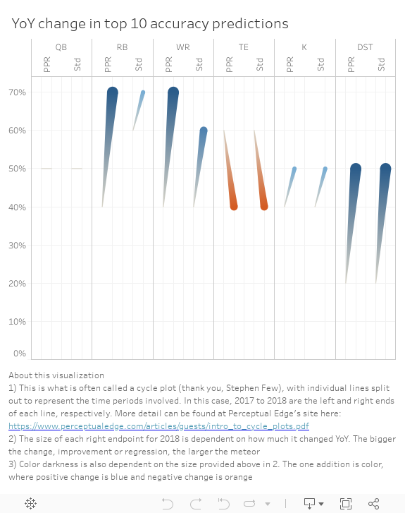
I wrote an ARTICLE on this topic last year. The story this year is a far departure from that article, which essentially stated that you could confidently consider skipping all of these rankings and just throw darts. The plot below represents how accurate analysts were this year at projecting the top ten players at each position. With the exception of tight ends (down 20%) and quarterbacks (no change), analysts got better at projecting every single position. The improvements weren’t minor either, as running back and wide receiver accuracy jumped from 40% to 70% for PPR scoring. DST accuracy became somewhat relevant with a jump from 20% to 50%.

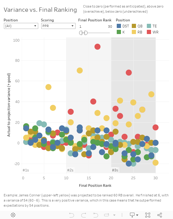
Who rose to the occassion and who crashed and burned? The last view presented the information at the aggregate level. Let’s now see each player separately. The plot below splits the players into tiers of #1s, #2s and #3s. The y-axis shows the answer to that question as to who rose and who crashed. The y-axis is the variance of projected to actual. If positive, the player rose to the occassion and did better than expected. If lower, they stunk it up. One that should pop out out in your mind is Le’Veon Bell. He came in as the #2 overall RB (and overall player in many rankings) and didn’t even show up to camp. With that, he isn’t even going to show up, as he didn’t score enough to even be a #3. As you can imagine, if you are near the centerline of 0 on the y-axis you finished exactly as you were expected to finish. Last thing, in addition to the splits for #1s through #3s, it is further split up by final rank within these groups.
DST example: Filter on position to DST and notice that the Rams are right at 0 on the y-axis and 2 on the x-axis. This means that they finished #2 overall in the rankings (as presented by the x-axis) and had no variance to where they were expected to finish at the beginning of the year (y coordinate of 0 = #2 preseason ranking – #2 final ranking).
RB example: Filter to RB and you’ll notice a player way at the top. I’ll come back to him (Phillip Lindsay) later. But just take note of how to identify overachievers, like him, quickly in this view.
The last view only showed the players finishing in the upper group, which would be frequent starters on a league roster. Not all players score enough during the season to get into that group. That said, many excel over their expected scoring and will have potential for the future.
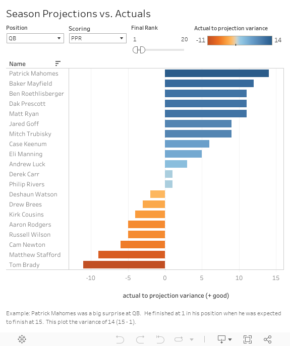
The next view makes sure that these players are viewed on the same footing as every other player. Note that I have the default filter set for QBs to avoid too much clutter. Please make use of the filters at the upper bar as needed. For instance, you will readily notice Baker Mayfield just after Mahomes under the QB filter. He should be on your radar for next year, as he only played a partial season this year and will be ranked much higher with a full season on deck.
QB example: Patrick Mahomes is right there at the top of the visual. As many of you might recall, Alex Smith was the highlight of last year at the QB position. He was projected to be #22 and finished at #4. Granted he moved to another team. Mahomes was stepping into a role on a team where the QB of the prior year outperformed expectations. More should have seen this coming.
RB example: First, you need to set up the visual. Edit the position filter to RB and the final position ranking to be at least 50 (drag the right side of the bar out further to the right). I drafted Royce Freeman (RF) in at least one league. That turned out to be unfortunate for me. He ended up losing nearly all of his carries to the undrafted Phillip Lindsay (PL) out of the University of Colorado. We should have known that anybody breaking records by the great Rashaan Salaam (R.I.P. ’16) had potential! You can hold your mouse over the bar for RF to see that he was projected at #17 and finished at #47. That makes for a bar length of 30 (17 – 47 = -30). PL, the player at the top of the RB list, was the benefactor of all of those RF carries. He was projected at #83 and finished at #13 (83 – 13 = 70). Not only did he beat RF, he finished even higher than RF was expected to finish (#13 vs. #17).
Some more reading on variance over the course of the season can be found HERE. This article shows how I integrate error into my weekly projections. You should take advantage of this, as I don’t know of another site with projections providing this feature. It’s especially valuable once a few weeks have gone by to make the sample large enough to chop away at the error.
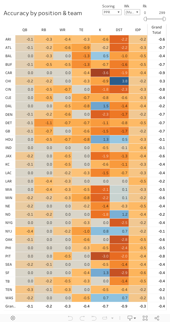
Beyond the fact that analysts were much better this year in predictions is that we can also see HERE how variances were from week to week. As you might imagine, the more granular you look, the more swings in accuracy you’ll see. That is precisely what you will see in the article at the link just mentioned. You can get a better idea as to how well analysts get an idea of player expectations by going up a level and looking at the entire season. This can be seen below.
Note that the values represent the sum of the variances for every player on each team at the given position. The legend isn’t included. That said, it’s fairly intuitive. The Bears are the darkest blue color. As you might be able to guess, they were the most under-rated pretty much every week (and this proves it). Carolina’s kicker(s) are the opposite, as they were consistently over-rated from week to week. It is quickly apparent that the shades aren’t nearly as dark in either direction for the main positions. This essentially means that analysts are pretty good at adjusting to the performance of players at every position and on every team (except for the less interesting K, DST and IDP positions).